

X_Color
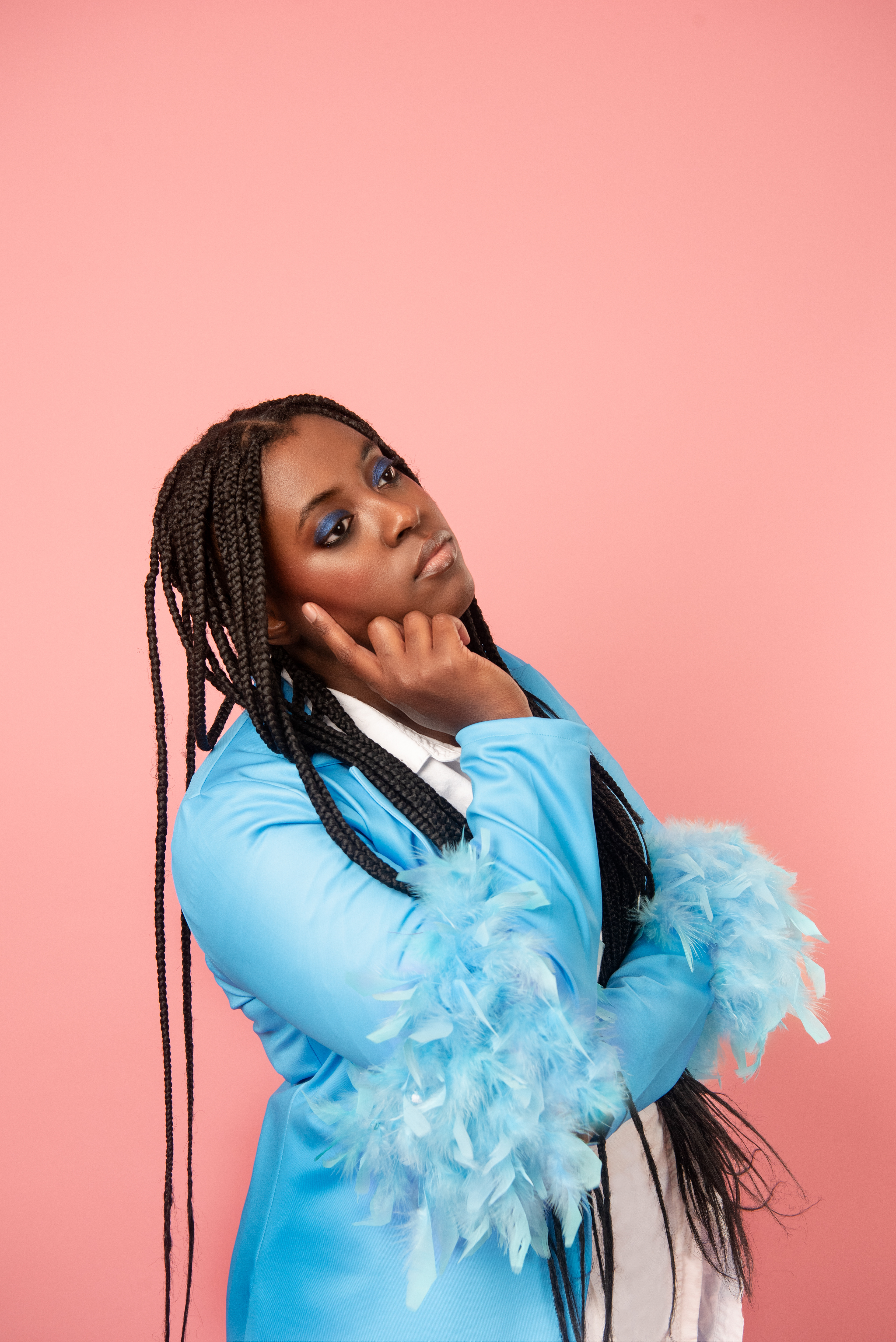
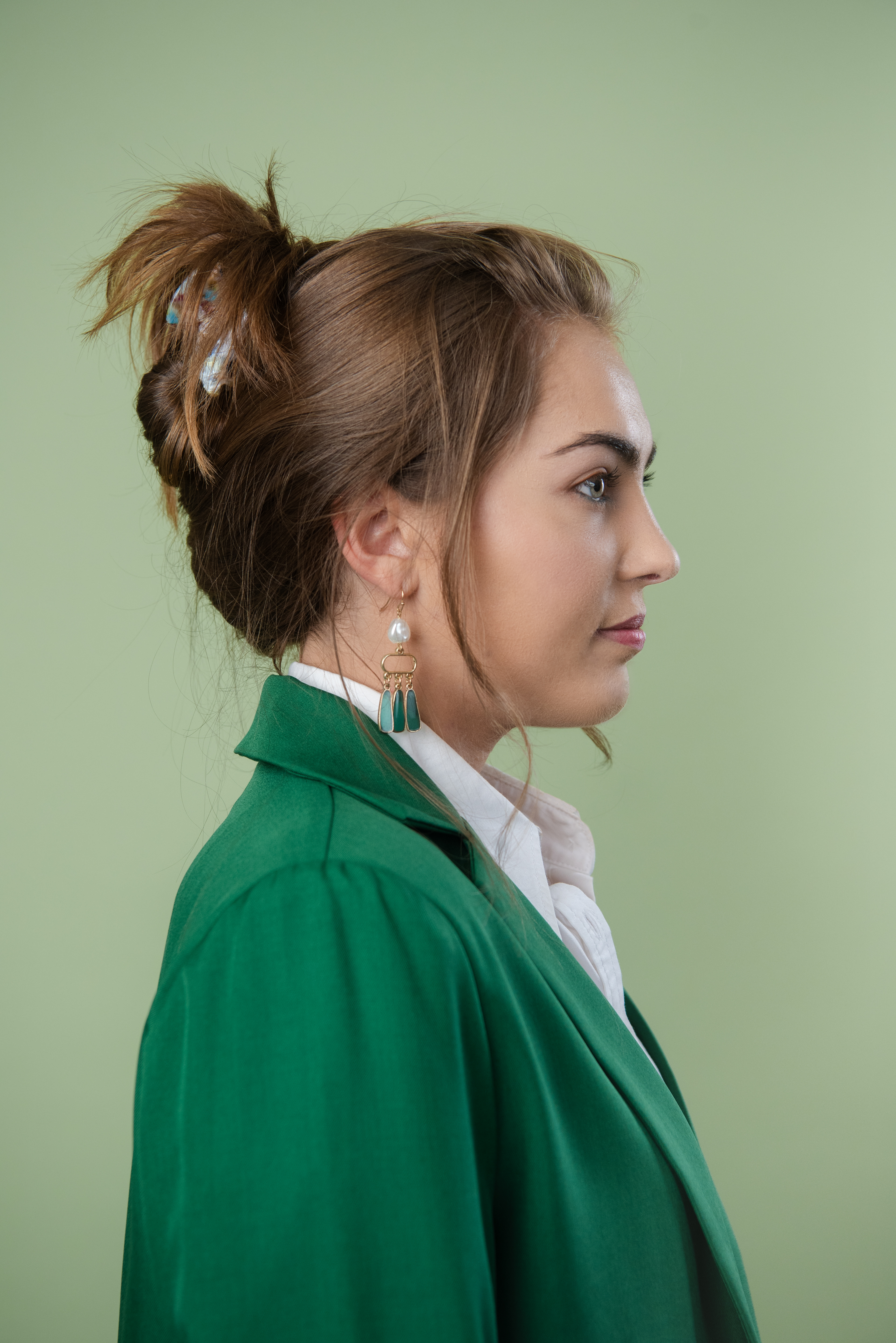
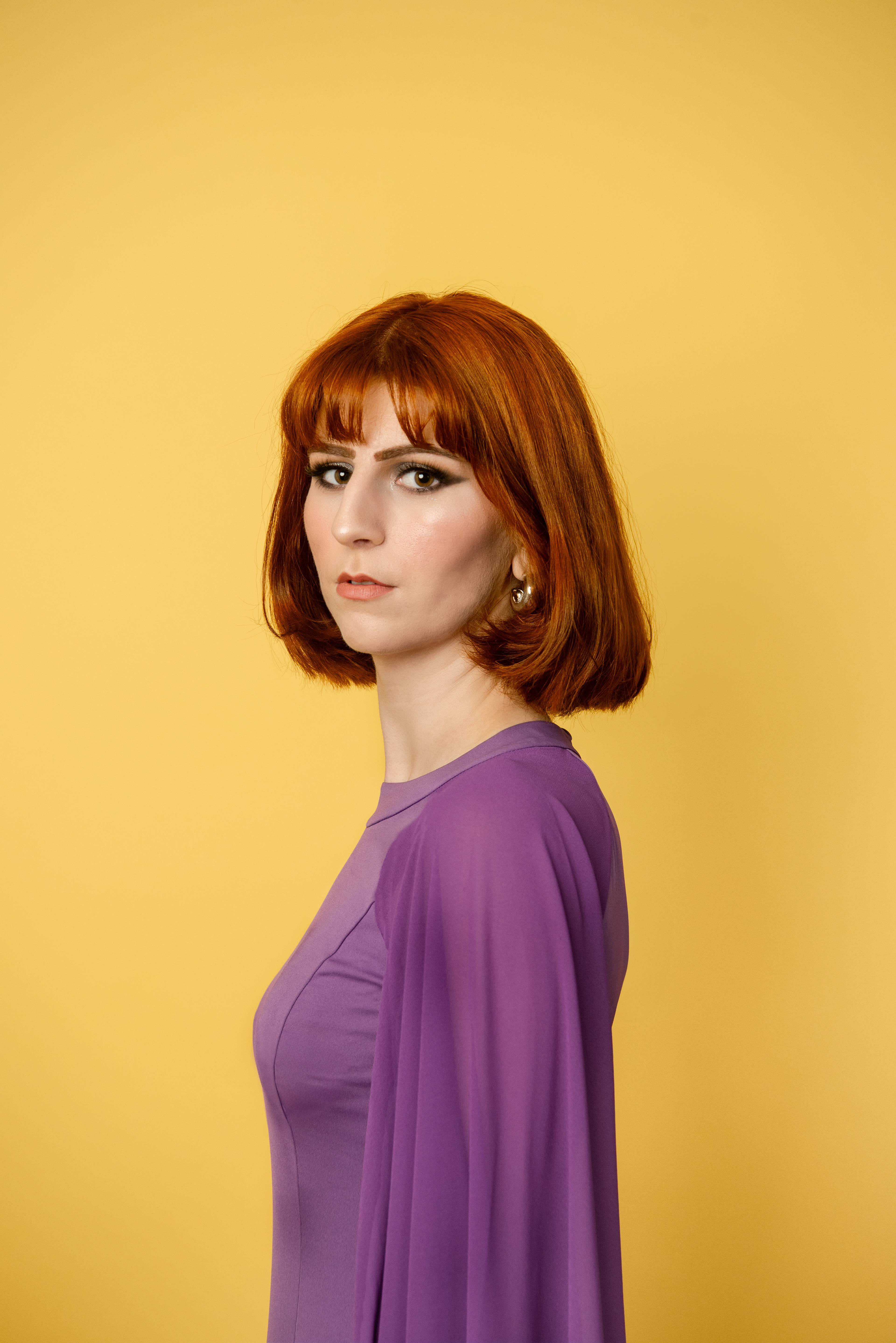
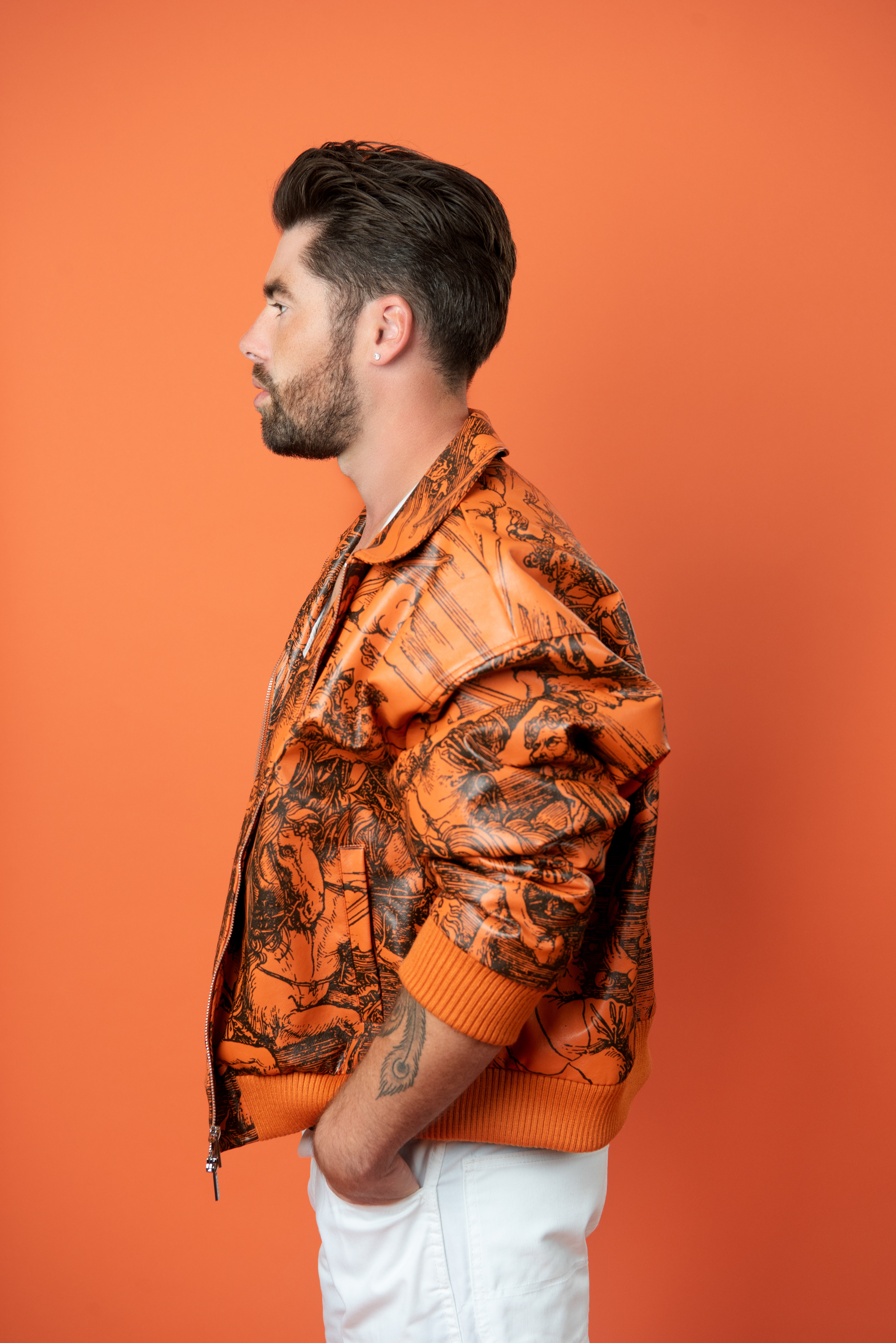
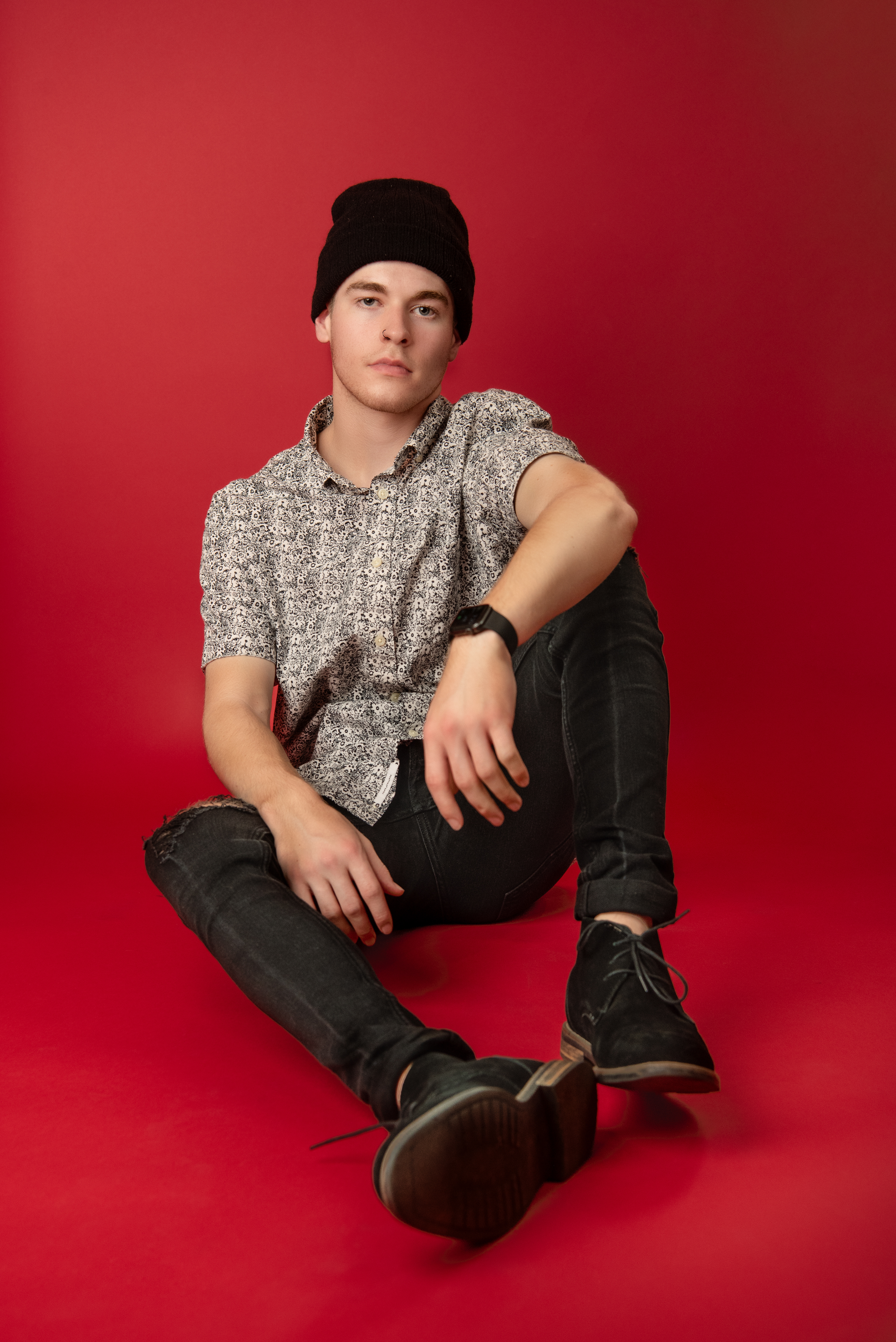
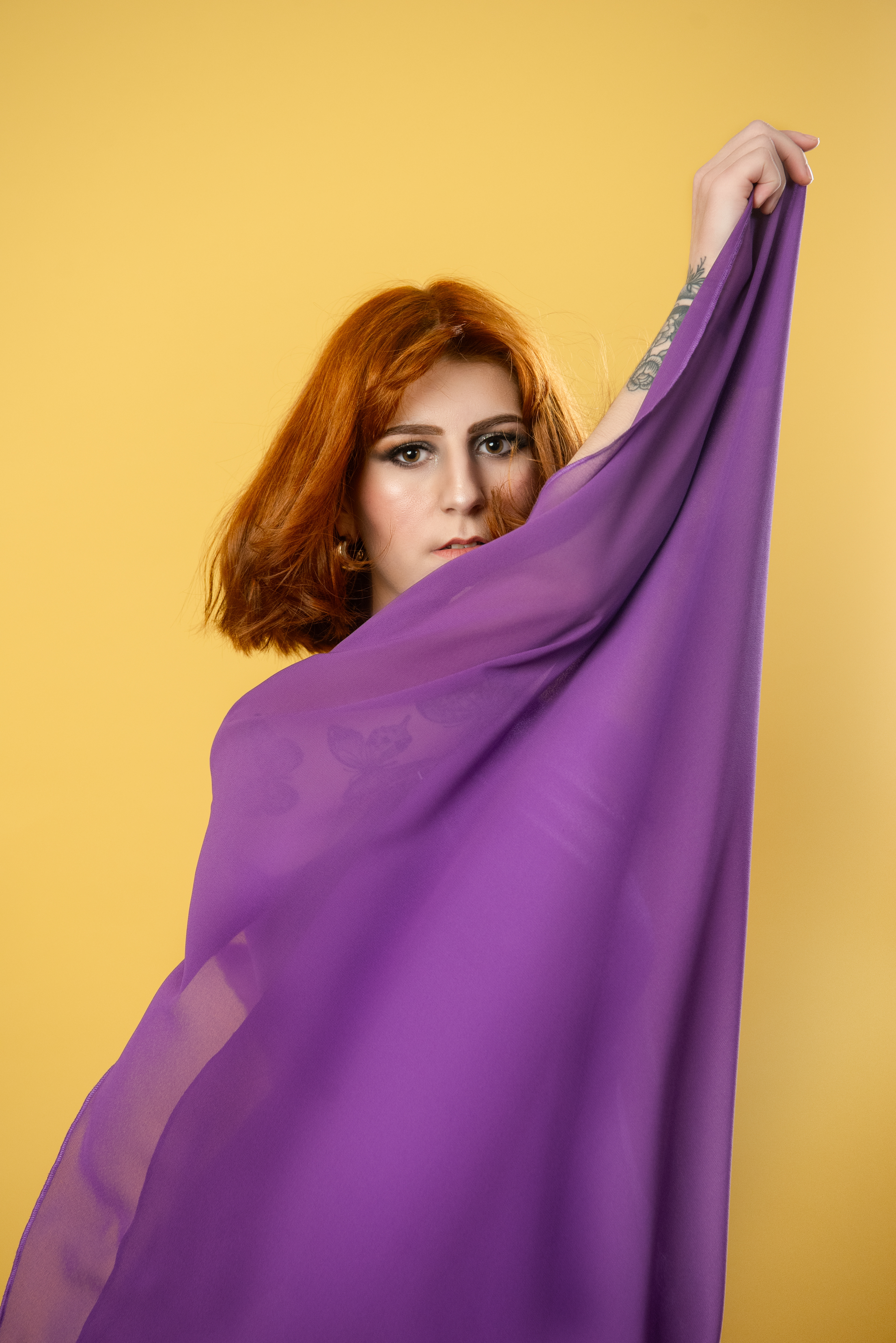
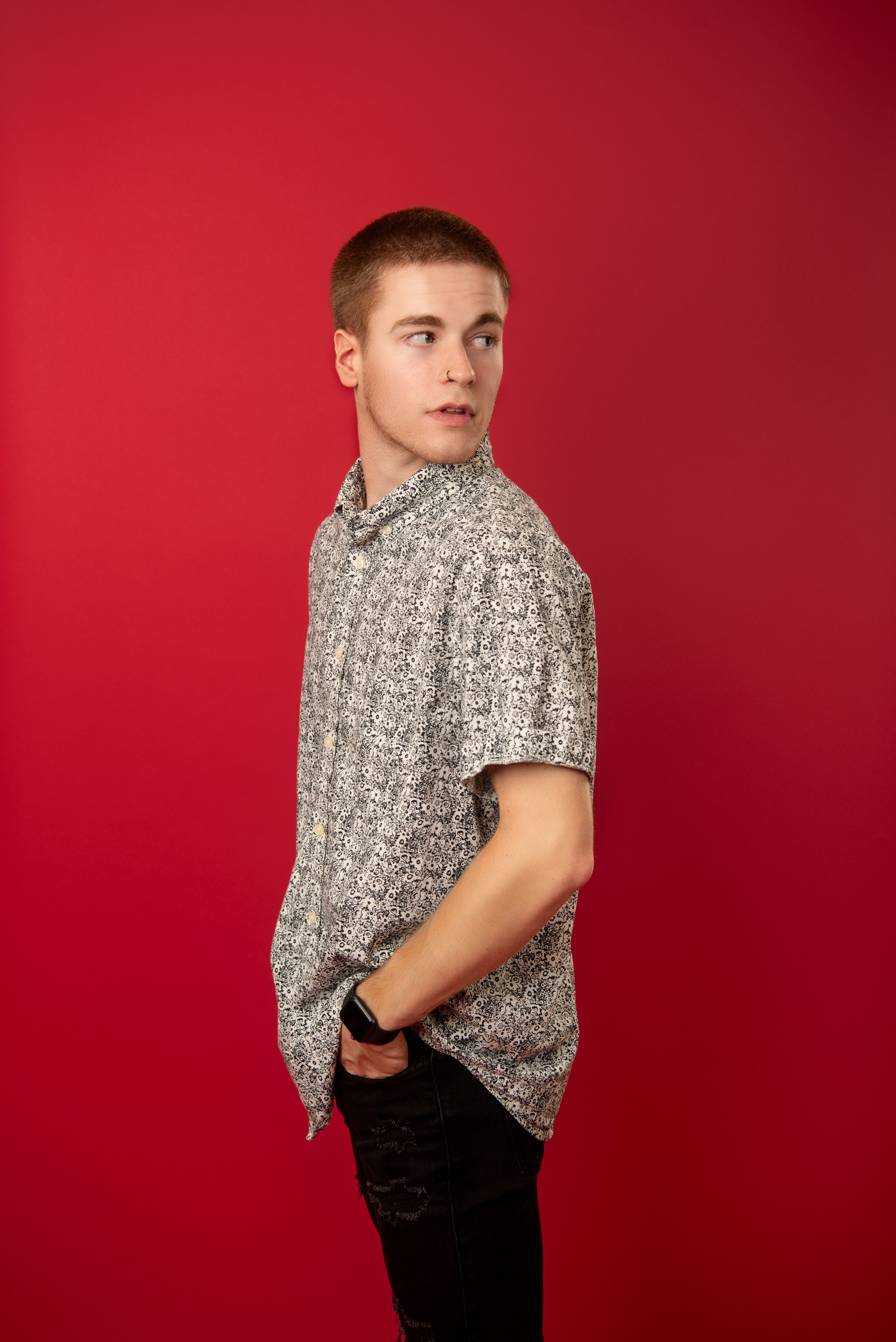
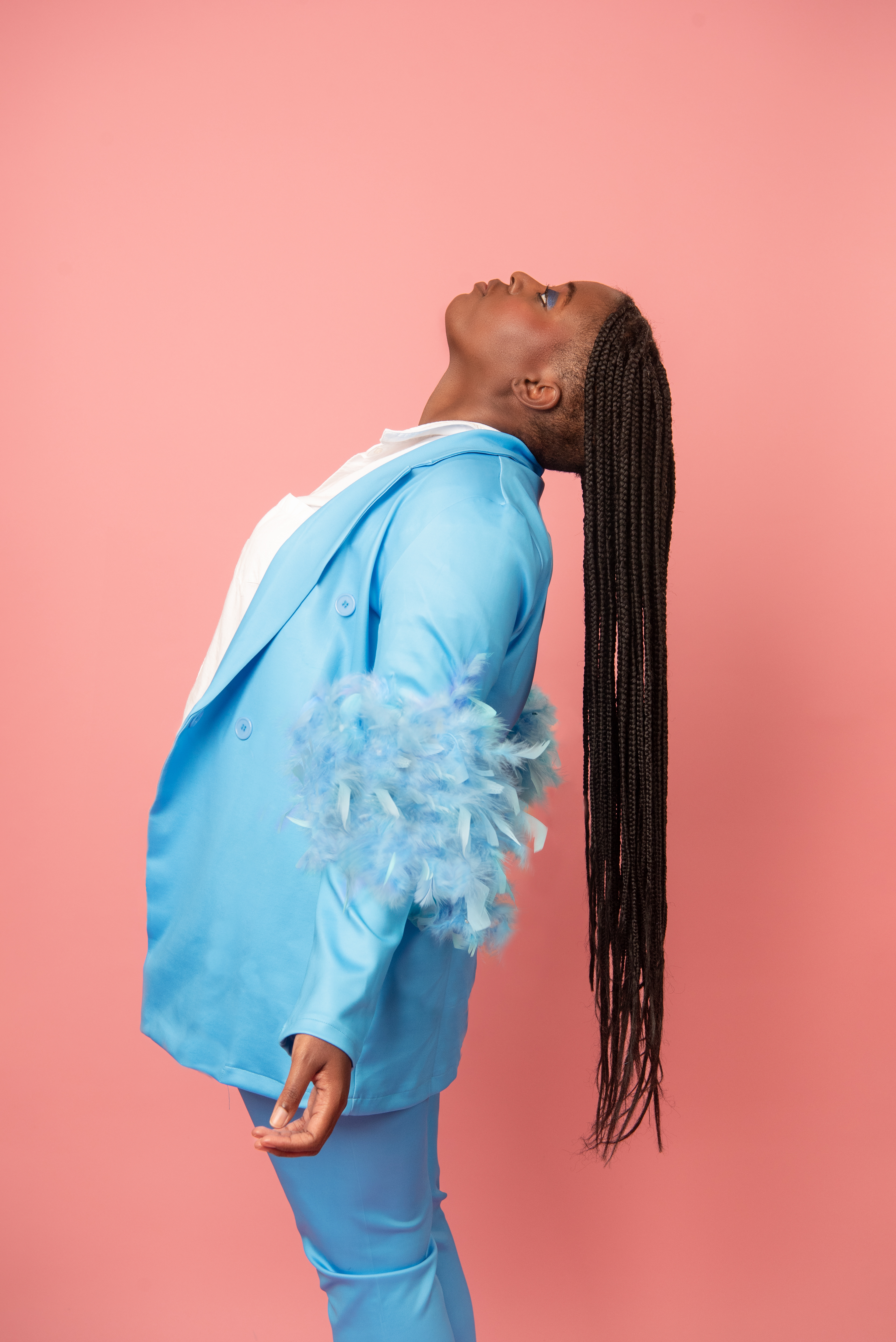
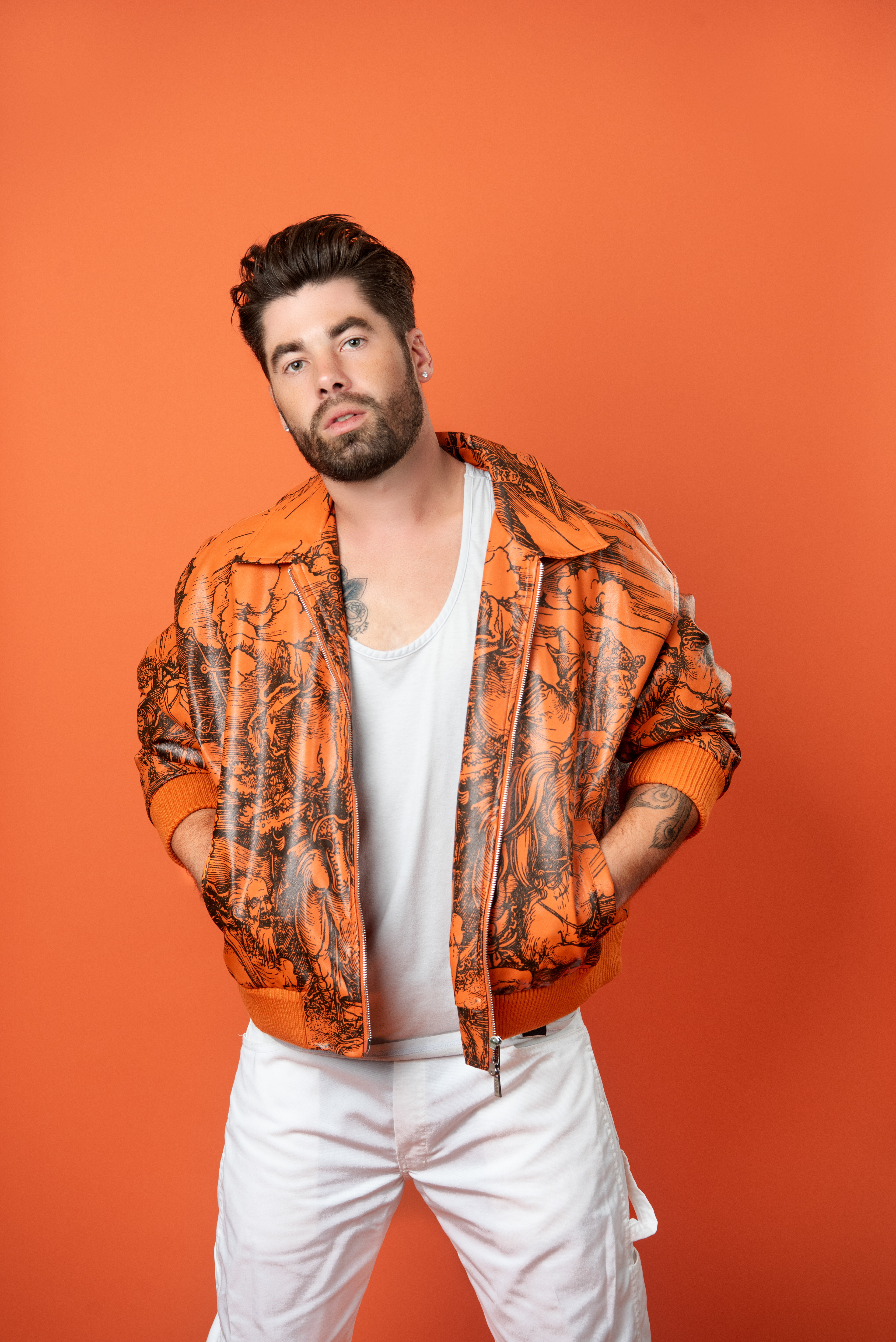
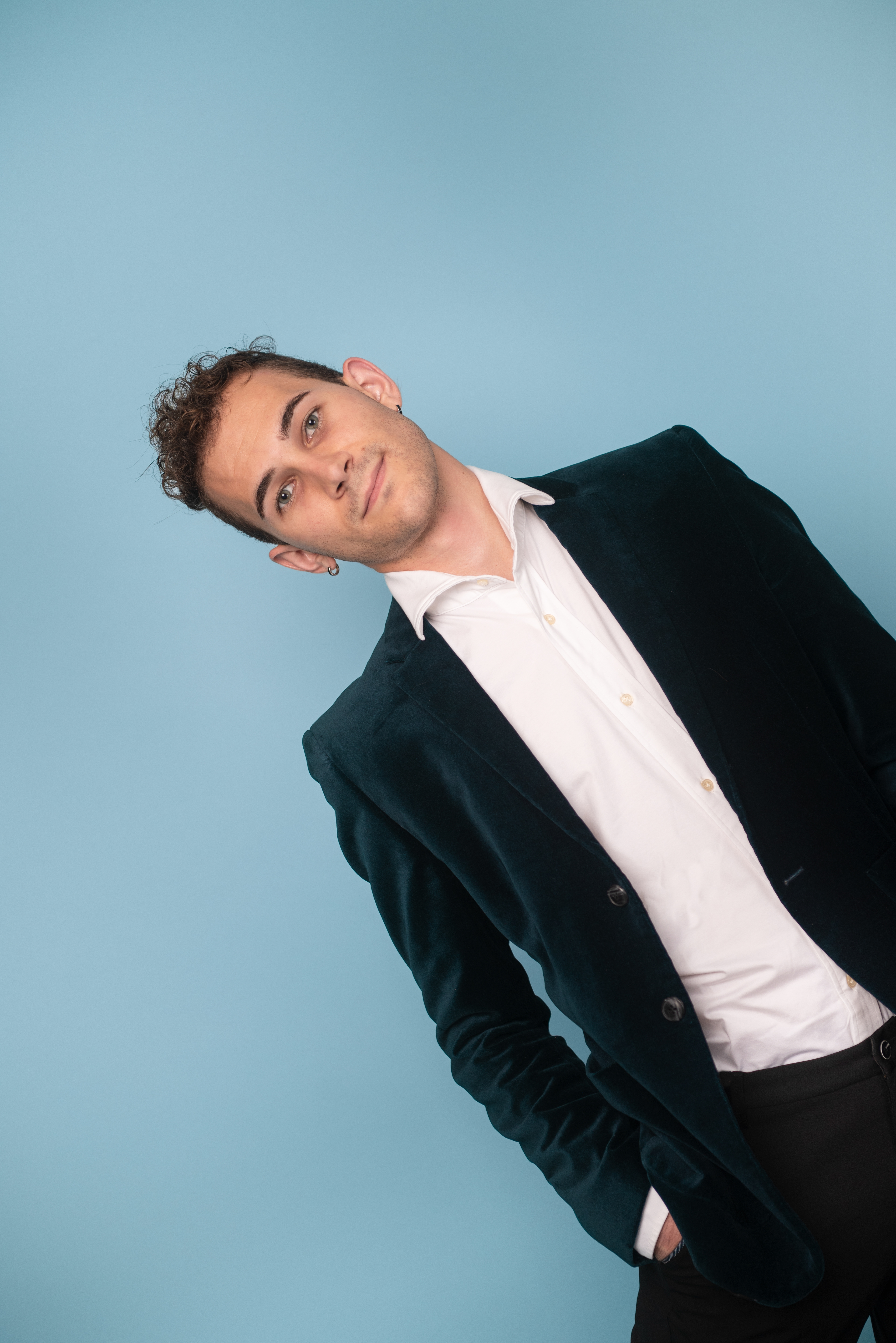
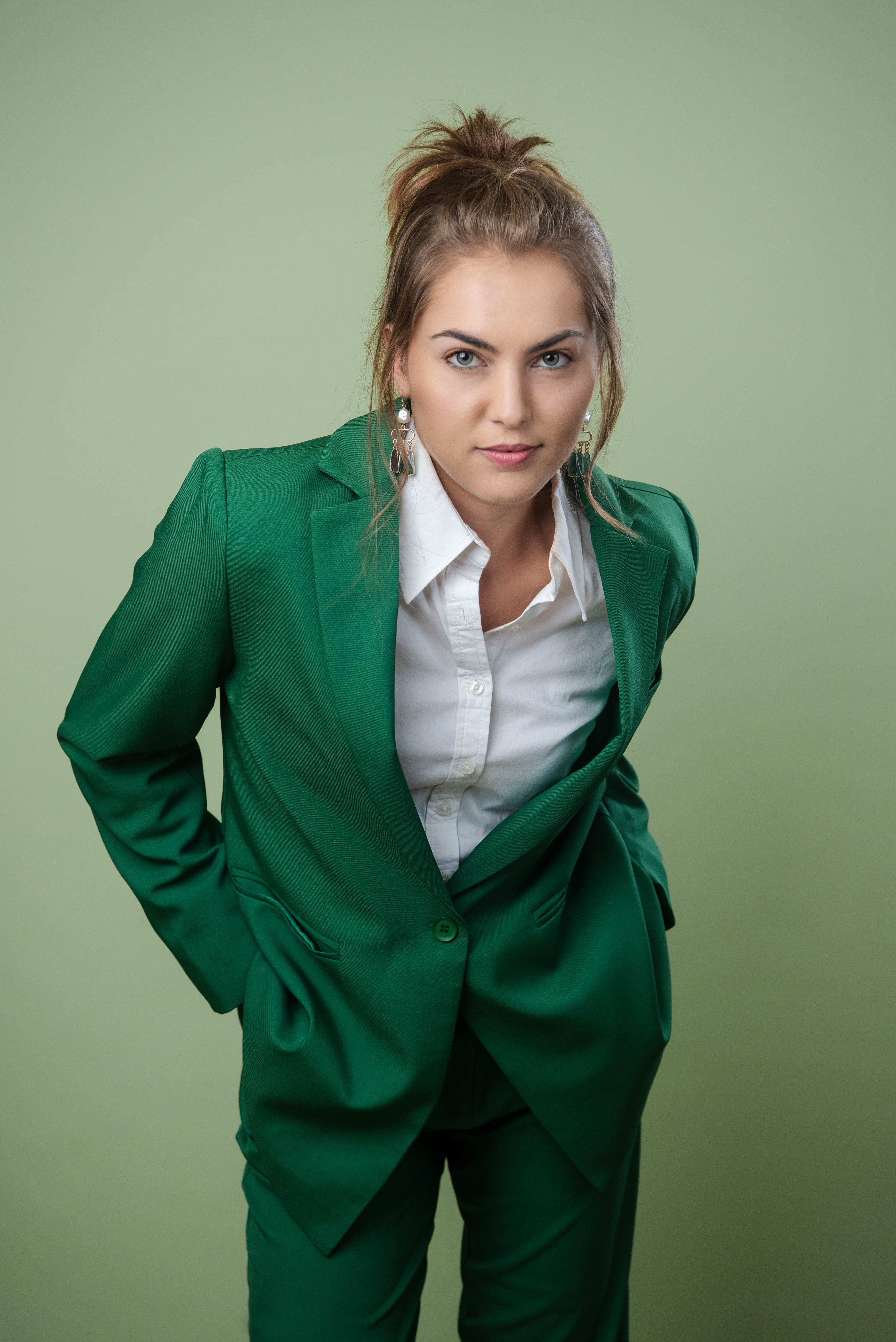
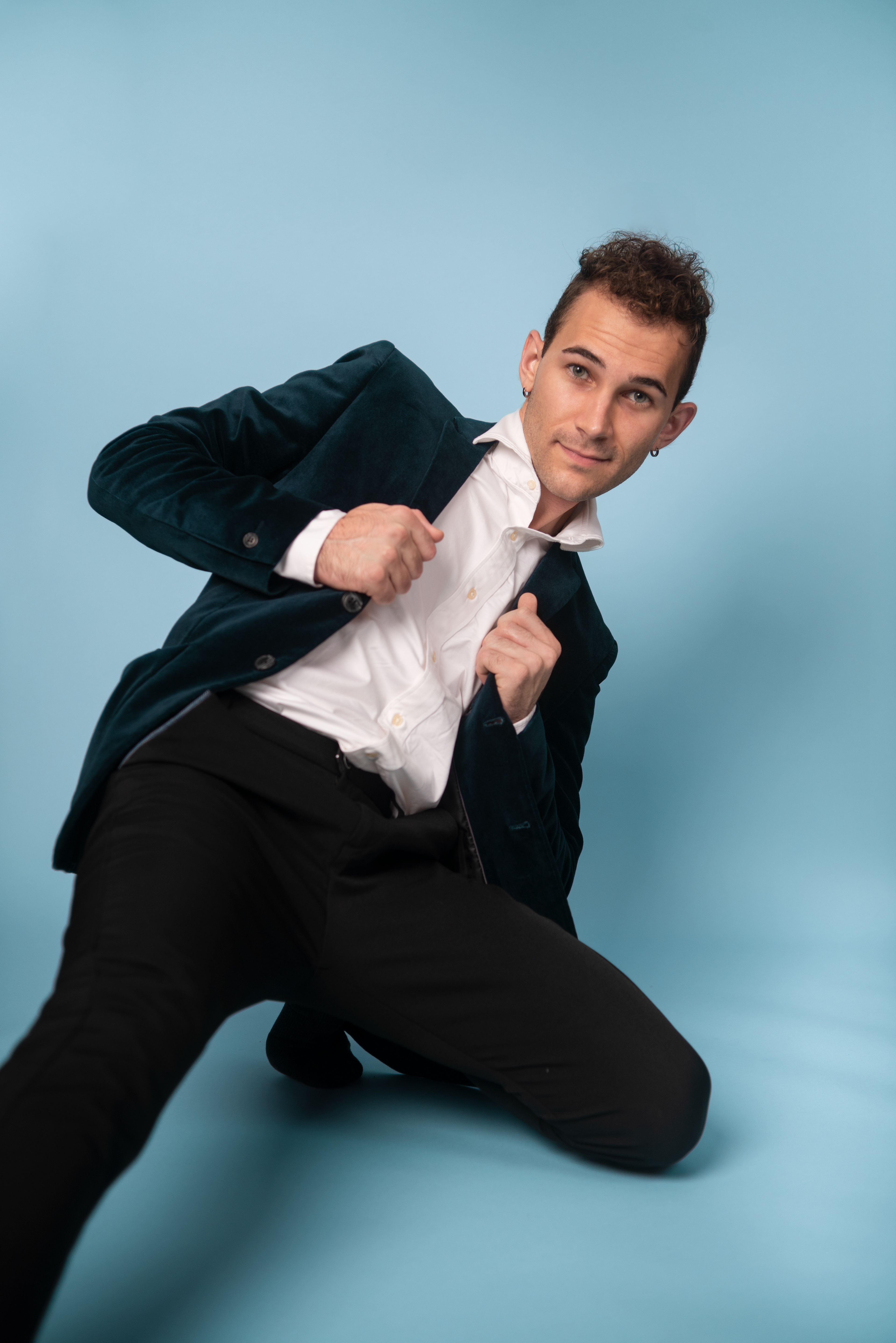
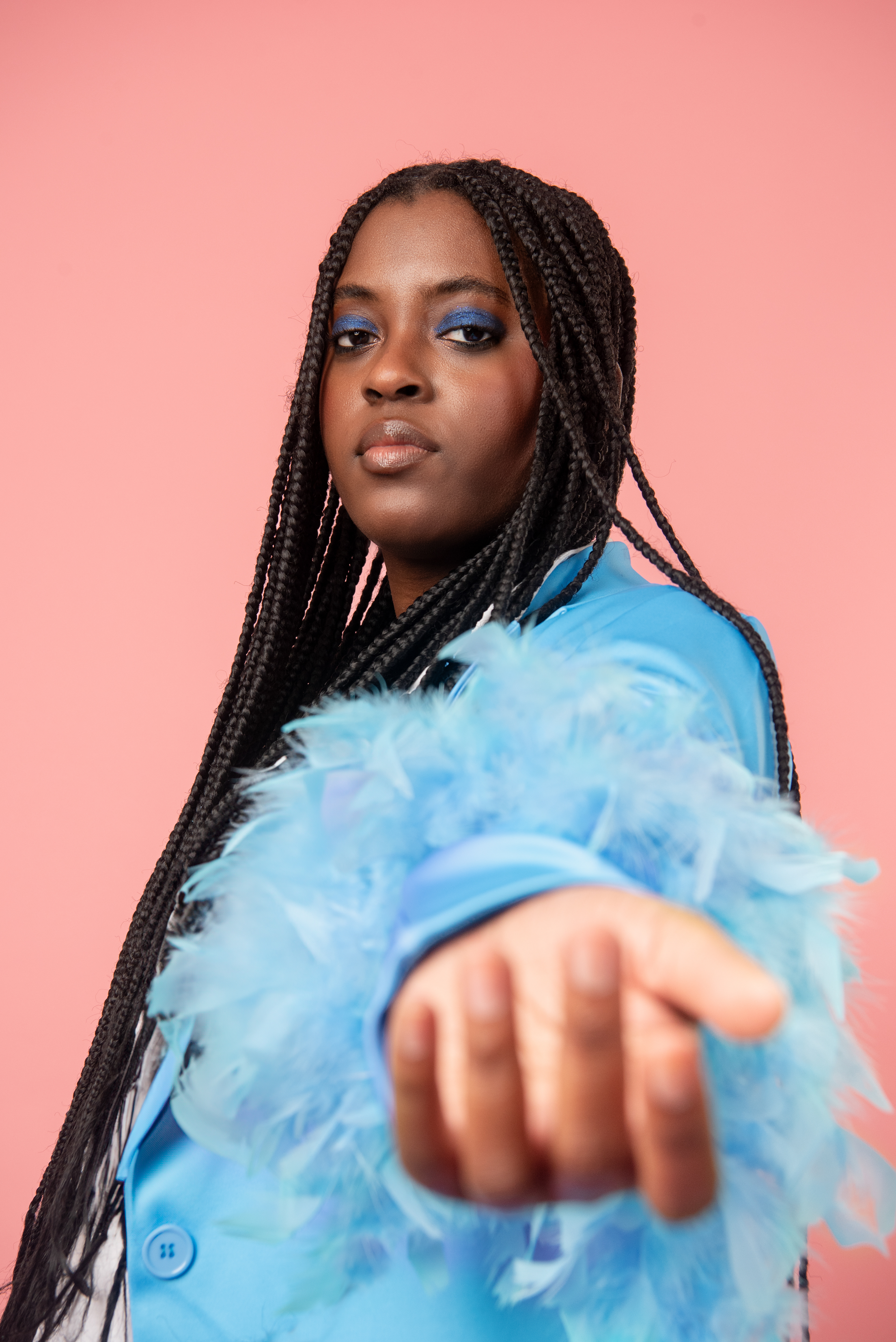
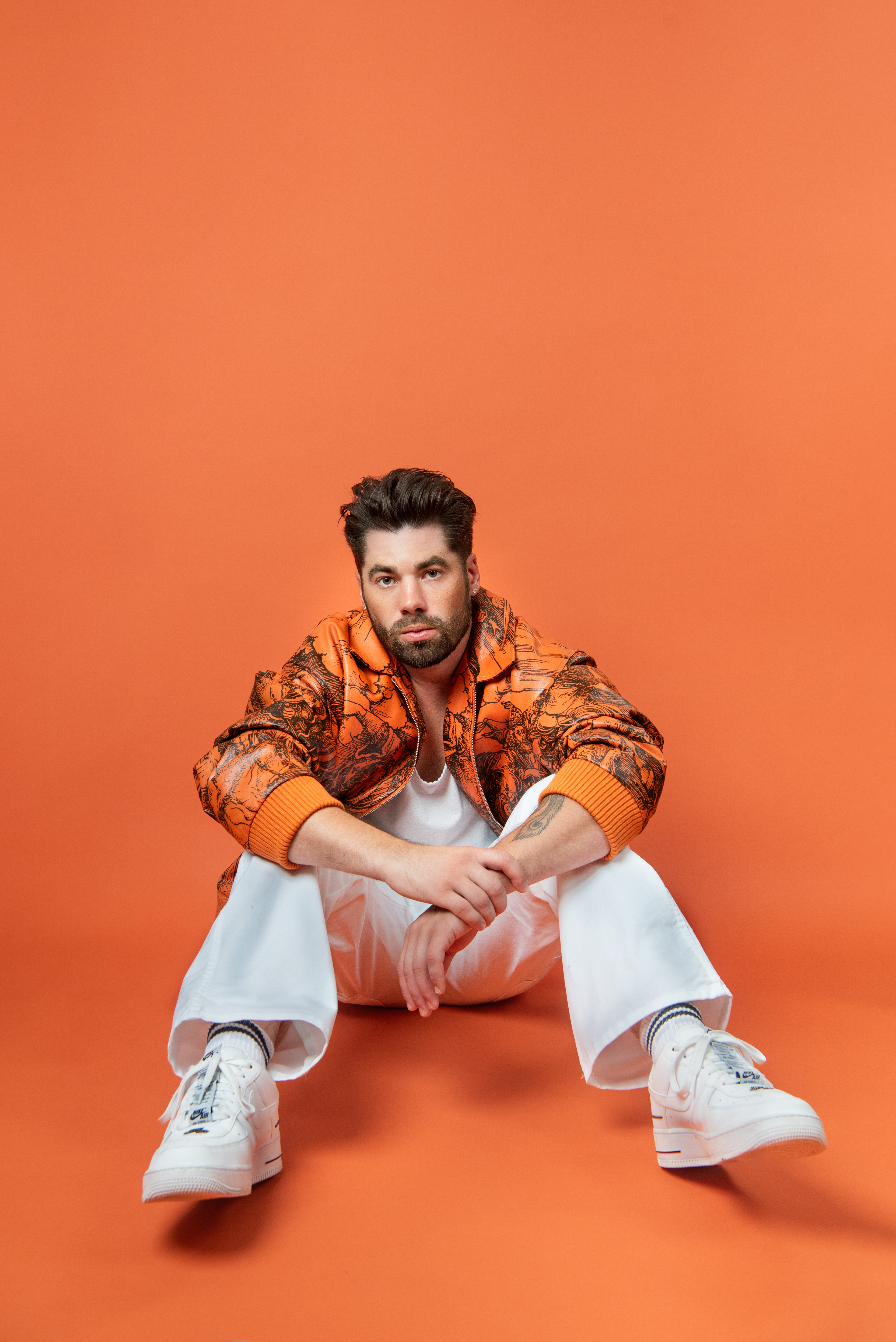
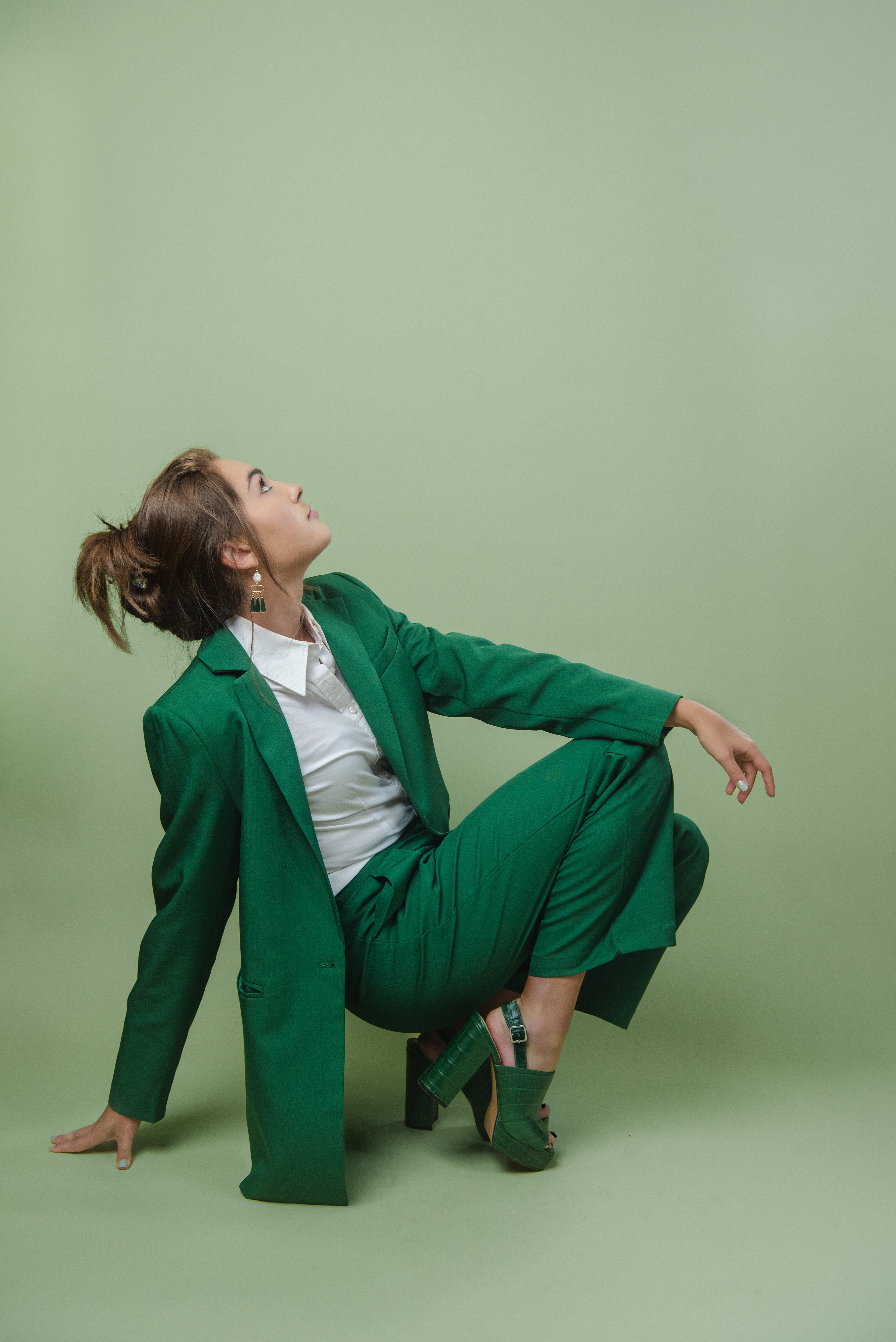
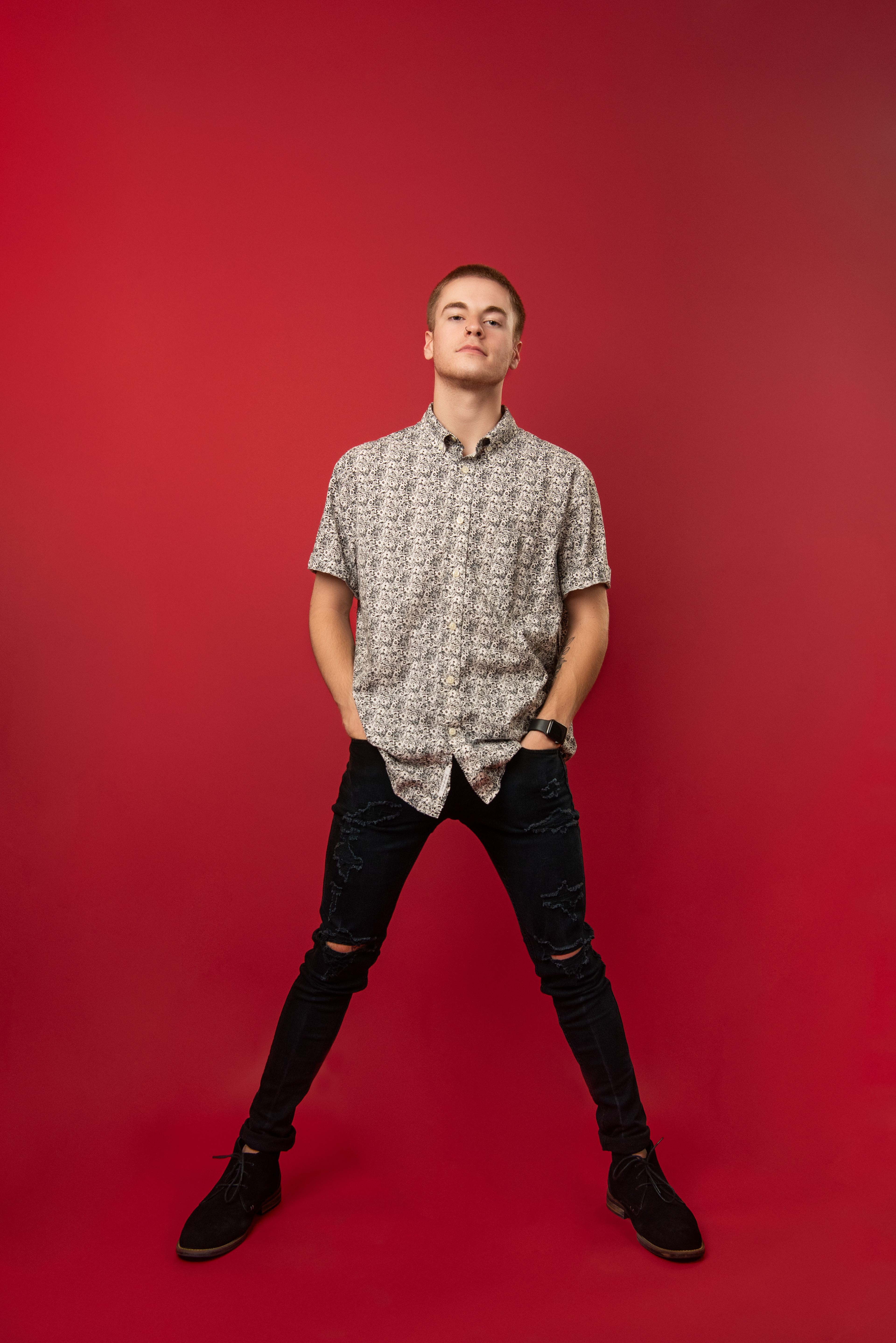
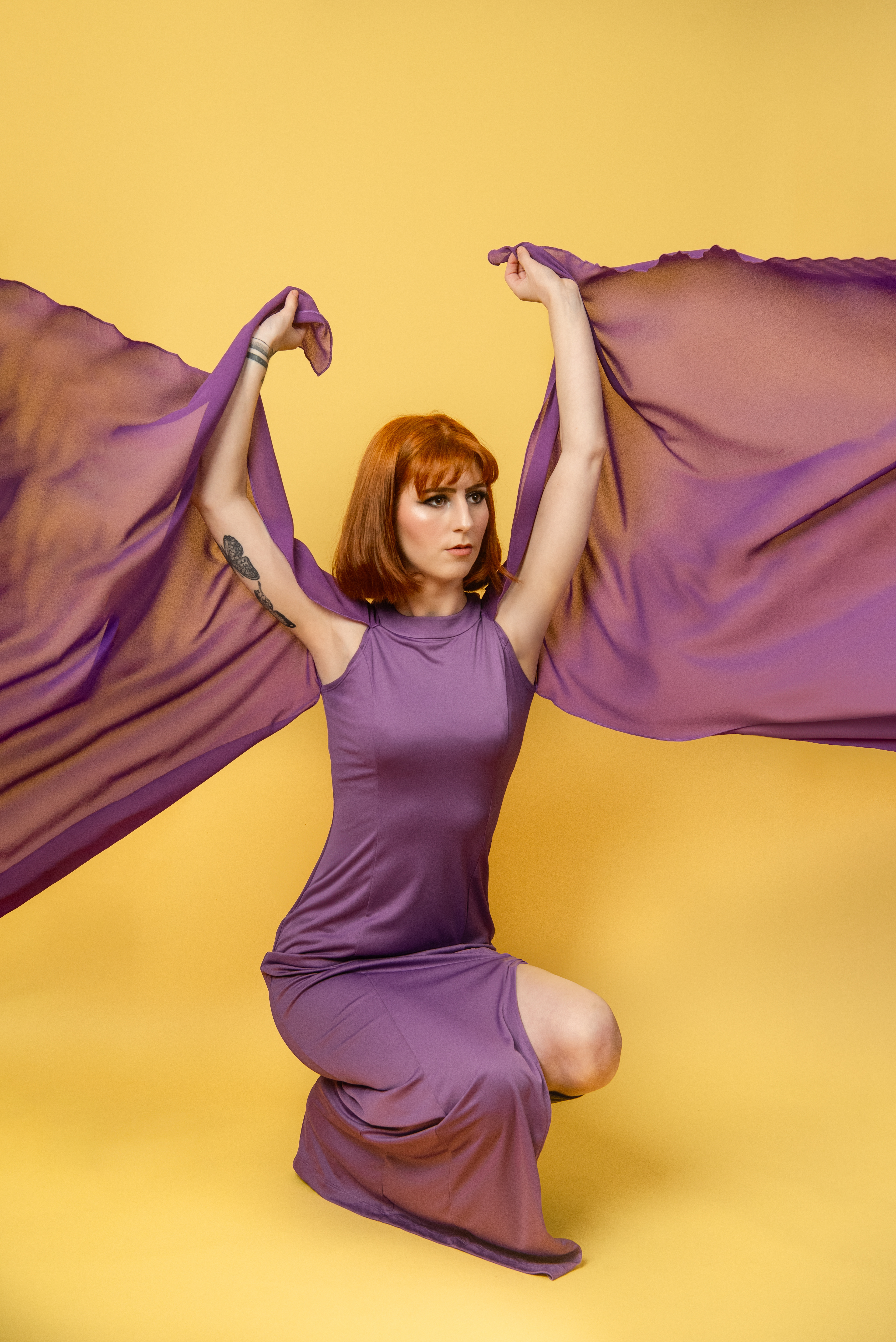
There really was no philosophical story behind this series. Essentially there was one idea and that was simply “color”. Big, bold, playful color. Take that and mix it with equally playful fashion and that is the core of this series. I have done many projects where I have planned out the whole theory and technical process behind them first but this one I chose to strip it down to the bare basics and give myself only one focus. By choosing to simply hone in on exploring color, I was able to really have fun with what I created in front of the camera. The fashion was not meant to be the focus but was meant to artfully complement the color. I tried analogous color schemes, complementary color schemes, or just all out wacky combos. Likewise I wasn’t trying to make traditional portraits. I wanted viewers to see the color before they saw the person. In my mind, the person photographed was just one piece of the puzzle rather than the story itself. The priority was to create something dramatic and use the unique features of each model to emphasize those playful, vibrant visuals. Because let’s face it, at some point you can only be so technical, and it’s at that point that you realize the thing that will get you through life is having fun. And that’s what this project was – playful, creative, colorful, and fun.
As a sidenote, the title for this project evolved into X_Color. Initially, this came from my titling scheme that I used on each photo shoot. It would be the person’s name, underscore, color. Eventually though, I came to realize that this appropriately represented what I was trying to create in the series. The focus was color, and everything else was just a variable used to emphasize that. Traditionally, X is considered a placeholder and in this series it represents the specific color, the model, or the overall image. It works as a stand in for everything else while still leaving “color” as the focus.